Print-Ready Files for Custom Merch: A Beginner's Guide
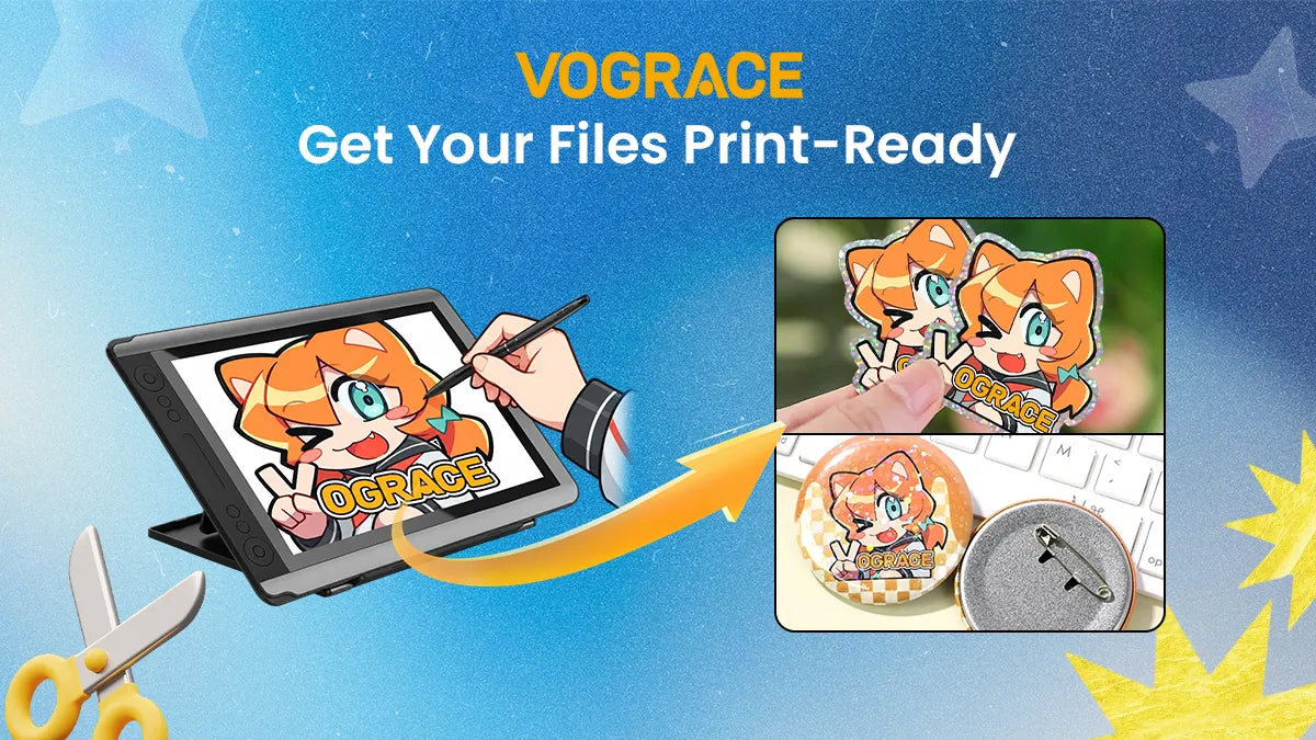
You’ve finished the artwork, picked the product, and opened the order page—then you see the line: “Please upload your print file.” If that makes you hesitate, you’re not alone. The challenge usually isn’t drawing; it’s knowing what production-ready artwork actually needs. RGB or CMYK? What is bleed? Why does the file need to be larger than the finished product? Should you send a PNG or a PDF? These are print-production rules, not drawing rules—and most artists are never formally taught them.
This guide fills in that gap. It brings together the file issues that repeatedly appear when creators prepare custom merch, including the key measurements, export settings, common failure points, and a practical preflight checklist. Save it for your next order so a preventable file problem doesn’t slow down production.
1. Four Common File Problems Behind Most Print Issues
|
What Goes Wrong |
Why It Happens |
What to Do |
|
The print looks blurry or fine lines look soft |
The resolution is too low, or a web image/screenshot was enlarged |
Use 300 dpi at the final print size |
|
Colors look very different from the screen |
The file was submitted in RGB or uses colors outside the printable gamut |
Work in CMYK from the start when possible; avoid fluorescent and extremely saturated colors |
|
Artwork is cut off or white edges appear |
There is no bleed, or important content sits too close to the trim edge |
Add 2–3 mm bleed and keep key content inside the safety area |
|
Edges look gray or muddy |
A white background was left in the file, or clear material was printed without the required white-ink base |
Use a transparent background and a white-ink layer where needed |
2. The Four Numbers That Define a Print-Ready File
· Trim size: the actual finished size of the product you receive.
· Bleed: extra artwork extending about 2–3 mm beyond the trim size.
· Safety margin: a protected area inside the trim line. Keep important content at least 3 mm in from the edge unless the product template says otherwise.
· Resolution (DPI): aim for 300 dots per inch at the final output size.
Why bleed is necessary
Cutting is a mechanical process, so the final cut can shift by roughly ±1 mm. If your background stops exactly at the trim line, even a small shift can reveal the unprinted material underneath. If text or a face sits too close to the edge, that same shift can cut into it. Bleed gives the machine room to move; the safety margin gives your design room to breathe.
Easy rule to remember: extend the artwork about 3 mm beyond the trim line, and keep important content at least 3 mm inside it.
3. Recommended Canvas Setup by Product Type
The values below are general references. Always follow the specifications on the exact product page or template you are using, especially for specialty finishes or custom shapes.
|
Product |
Common Trim Size |
Bleed |
Safety Area |
Watch Out For |
|
50–75 mm / 2–3 in |
2 mm on all sides |
3 mm |
The outer contour is also the cut path; keep the main subject away from the edge. |
|
|
75–150 mm / 3–6 in |
2 mm on all sides |
3 mm |
Avoid placing critical details near the bottom slot area. |
|
|
As needed |
2–3 mm on all sides |
3 mm |
Keep the cut line on a separate layer. |
|
|
Sticker Sheet |
A6 / approx. 4 × 3.5 in |
2 mm on all sides |
3 mm |
Check the overall kiss-cut boundary and the spacing between individual stickers. |
|
2.5 × 3.5 in / 63.5 × 88.9 mm |
3 mm on all sides; file approx. 2.75 × 3.75 in |
3 mm |
Bordered designs show trim shifts most easily. |
|
|
Poster / Art Print |
As needed |
3–5 mm on all sides |
3–5 mm |
For large-format artwork, 150 dpi may be used as a starting point. |
|
58 mm / 2.25 in is common |
3–5 mm on all sides |
5 mm |
The outer artwork wraps around the edge toward the back, so edge content may not remain visible. |
4. Color: Why Your Blue Can Print More Purple Than It Looks on Screen
Screens create color with light (RGB), while printing relies on reflected light and CMYK inks. Because the printable color gamut is smaller, a finished print can look roughly 10–20% darker than the artwork on your display. That difference comes from the two color systems—not simply from whether the artwork looked bright on your monitor.
Three practical ways to reduce color surprises:
1. Work in CMYK from the beginning when the product workflow supports it. If you convert an RGB file later, review and adjust the colors after conversion.
2. Be careful with fluorescent colors and extremely saturated blue-purple or emerald-green tones. These are common examples of colors that can fall outside the CMYK gamut.
3. Avoid mixing unmanaged RGB assets into the same production file. Forced conversion at export can create unpredictable shifts.
How to use black
For small text and fine lines, use 100% K black rather than a four-color rich black. This helps reduce softness and registration issues. Reserve rich black for larger solid black areas, and keep total ink coverage below 300%.
White ink on clear acrylic
On transparent acrylic, a white-ink underbase helps colored ink look fuller and more opaque. If you want part of the design to remain see-through—such as a window, glass, or water effect—leave white ink out of that area intentionally. This is one of the most important production details to understand when designing clear acrylic merch.

Figure 1. White ink on transparent acrylic: use a white underbase for opacity, or omit it where you want the material to stay clear.
5. Resolution, Line Weight, and Type Size: Three Easy Details to Miss
· 300 dpi is calculated at the final print size. For example, a 3-inch charm needs artwork at least 3 × 300 = 900 pixels along that dimension, plus the pixels required for bleed.
· Do not enlarge a small web image and expect it to become print-ready. Pixels cannot be created from nothing; an image that looks fine on screen at 72 dpi may still print blurry at the intended physical size.
· As a general reference, keep the thinnest lines at about 0.5–1 pt or heavier, and use type no smaller than roughly 6–8 pt. Light text reversed out of a dark background should be larger or bolder so the fine strokes do not fill in.
· For line art, logos, and cut paths, use vector formats such as AI, SVG, or EPS whenever possible. Vectors can be scaled without becoming pixelated.
A simple self-check: review the artwork at 100% in your design software at the intended output size. If an edge already looks soft or pixelated there, it is unlikely to improve in print.
6. How to Use Bleed and the Safety Area in a Real Layout
A dark-background design is a good example of why bleed matters. If the background ends exactly at the trim line and the cut shifts even slightly, a white edge can appear. Extending the background beyond the trim line prevents that visible gap. 
Figure 2. Bleed provides tolerance for small cutting shifts; without it, the substrate can show at the edge.
· Extend background colors and artwork all the way through the bleed area. Do not stop at the finished trim line.
· Keep critical details—faces, eyes, small text, and logos—inside the safety area.
· A common layout mistake is centering the composition only within the trim box. Check the full bleed canvas as well so the artwork remains visually balanced after cutting.
· For acrylic standees, keep important details away from the bottom slot area. For trading cards, thin border frames are especially sensitive to small trim shifts.
7. Layers and Transparent Backgrounds: Clean Up the File Before You Send It
· Layer separation tells production which line is artwork and which line is used for cutting or another process.
· A practical layer structure is: 1) Artwork; 2) CutLine (solid-color stroke, about 1 pt, clearly named); 3) White Ink, if needed; 4) Notes or instructions.
· For transparent artwork, remove any white background box. Also make sure your software’s transparency checkerboard is not accidentally exported as part of the image.
· Convert text to outlines before export when appropriate. This helps prevent layout changes if the receiving system does not have your font installed.
· After exporting, reopen the final file once. Many production mistakes happen during the export step rather than inside the original working file.
8. Final Print-File Checklist
Before uploading your file, run through this list to reduce back-and-forth during prepress:
☐ Resolution is 300 dpi at the final output size.
☐ Color mode is CMYK, unless the product or special process requires something different.
☐ The canvas includes about 3 mm of bleed, and the background extends fully to the bleed edge.
☐ Important content stays safely inside the trim line. The product table uses 3 mm as a general reference; for a more conservative final check, allow about 5 mm where the product layout permits.
☐ The file does not rely on fluorescent or extremely saturated colors that are difficult to reproduce in CMYK.
☐ Small black text and fine black lines use 100% K.
☐ Transparent-background artwork has no unintended white block behind it.
☐ The cut line is on its own clearly named layer.
☐ The exported file has been reopened and checked at 100% for clean edges and correct transparency.
9. Common Questions About Print-Ready Artwork
Q1. My artwork is RGB. Why does it look duller after I convert it to CMYK?
That is normal because CMYK has a smaller color gamut than RGB. You can adjust saturation after conversion or fine-tune the file with a Hue/Saturation adjustment layer. If you need a very specific bright color, check whether the product supports spot-color printing.
Q2. Do I need to draw a visible bleed line myself?
No printable bleed line is required. What matters is that the background or artwork extends through the bleed area. When you use a Vograce template, the bleed line and safety line are already marked as guides, so you can build the design directly against those references.
Q3. I only have one illustration and no separate background. How do I create bleed?
You can extend the edge pixels outward, use a blurred or stretched continuation of the background, or fill the bleed area with a matching solid color or simple pattern. For round products such as buttons, keep the main illustration centered and let the surrounding color or pattern extend to the bleed edge; the visible finished area will remain unchanged.
Q4. Why does my transparent file turn black or white after export?
Check that you exported as PNG and enabled transparency. JPG does not support transparent backgrounds. In most design software, a checkerboard background indicates that the transparent area is working correctly.
Q5. Can Vograce check my file before production?
Yes. Vograce provides a free prepress file-checking service after an order is submitted. If the team finds a file issue, they will contact you to revise it. Doing your own preflight check first can still save time and help the order move into production more smoothly.
Final Thoughts
Print-file setup becomes much easier once you understand the core ideas: resolution, color mode, bleed, safety areas, transparent backgrounds, and production layers. Getting those details right can prevent around 90% of the common file problems that delay custom merch orders.
We’ll keep publishing more product-specific setup guides to help you move from “I’m not sure how to prepare this file” to confident, production-ready merch design.