CMYK vs RGB for Printing: Which Color Mode Should You Use?
Your design can look perfect on a tablet or computer screen and still feel different when it becomes a physical product. Bright blues may shift, neon pinks can lose some intensity, and deep shadows may print differently from what you saw on screen.
That does not automatically mean something went wrong in production. In many cases, the difference begins earlier, with RGB vs CMYK and the way screens and printers create color.
If you are preparing images for custom keychains, stickers, prints, cards, packaging, or other printed products, understanding these two color modes can help you avoid unnecessary surprises.
RGB vs CMYK: What’s the Difference?
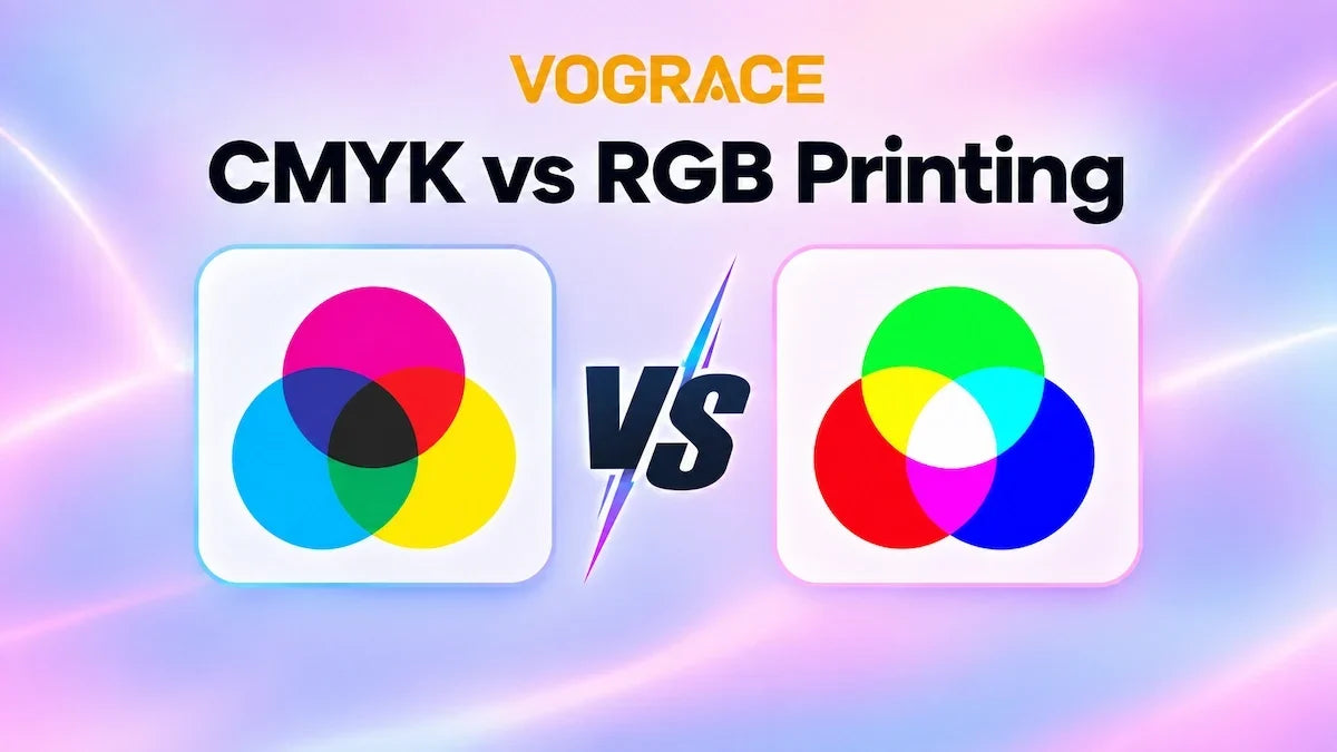
RGB and CMYK are designed for different ways of displaying color.
|
|
RGB |
CMYK |
|
Stands for |
Red, Green, Blue |
Cyan, Magenta, Yellow, Black |
|
How color is created |
Light is added together |
Ink or colorant absorbs light |
|
Best suited to |
Screens, websites, digital images |
Physical printing |
|
Color range |
Generally wider |
More limited than RGB |
|
Common issue in printing |
Some vivid colors cannot be reproduced exactly |
Better reflects the printable range |
RGB is an additive color model. Screens create color by combining red, green, and blue light. Because light can produce very bright, saturated colors, RGB files may contain colors that standard CMYK printing cannot reproduce exactly.
CMYK is a subtractive color model commonly used for printing. Instead of emitting light, printed color depends on cyan, magenta, yellow, and black inks or colorants interacting with a physical surface.
That difference is why a glowing RGB blue on your monitor may become a slightly more restrained blue in print.

So, Should You Use RGB or CMYK for Printing?
For files that will be printed by Vograce, the final production file should be prepared in CMYK. Vograce currently uses Japan Color 2001 Coated as its default CMYK profile for applicable print workflows.
But that does not mean every design needs to be created in CMYK from the beginning.
A practical workflow is to keep an editable RGB master file while you design and make major color adjustments, then create a separate print version and convert it to the required CMYK profile before uploading.
This keeps your original file flexible while giving you a chance to see which colors change during conversion.
If you already work comfortably in CMYK, especially for flat-color designs or files created specifically for printed products, starting in CMYK can also make sense.
The most important thing is knowing the final production requirements before you export.
Why Do Some RGB Colors Change in CMYK?
The biggest reason is color gamut: the range of colors a color space can reproduce.
RGB usually has access to more highly saturated colors than standard CMYK printing. Electric blues, bright greens, neon-style pinks, and intense purples are common areas where you may notice a difference.
When an RGB color falls outside the printable CMYK gamut, it has to be mapped to a printable alternative.
As a result, the printed color may look:
· less saturated
· slightly darker
· somewhat different in hue
There are other factors too.
Your monitor produces light, while a printed product reflects ambient light. Screen brightness, monitor calibration, printing material, surface finish, transparency, white ink, and surrounding lighting can all affect how the final color appears.
This is especially important with custom products. The same image can look different on paper, clear acrylic, fabric, or another material even when the original file is unchanged.
What Happens If You Upload an RGB File to Vograce?
Vograce’s current production guidance is based on CMYK.
If an RGB file is submitted, its colors need to be converted to the closest available CMYK equivalents before printing.
That conversion is exactly where highly saturated RGB colors may shift.
For more predictable results, it is better to make the conversion yourself before ordering, review the CMYK version, and adjust any important colors while you still control the file.
This is generally safer than designing with a very wide RGB color range and only discovering the differences after the file enters production.
How Vograce Works With Color in Production
Color preparation is only the first part of the manufacturing journey.
As part of Vograce’s 2026 factory upgrade, more of the production workflow has been made visible: files move through preparation, printing, processing, finishing, quality checks, and packaging.
The updated printing environment includes Indigo and UV printing equipment, with calibration and inspection built into the process.
After printing, checks can include color variation, image and line accuracy, and whether the correct production method has been used.
For color-sensitive orders, comparison tools and equipment calibration can also help production teams evaluate color more consistently instead of relying only on visual judgment.
This is why good color results depend on both sides of the process.
A well-prepared print file gives production a better starting point, while the manufacturing process is responsible for reproducing, inspecting, and controlling that design as it becomes a physical product.
How to Prepare Files for More Predictable Print Colors
The simplest rule is: do not judge print color only by how bright it looks on your screen.
Before submitting your file, convert a copy to the required CMYK profile and review the areas most likely to change.
Pay extra attention to:
· very bright blues
· saturated greens
· vivid pinks
· intense purples
· heavily saturated shadows
Keep your original layered file so you can go back and adjust colors if necessary.
It is also best to avoid repeatedly converting the same file between RGB and CMYK, as repeated conversions can change color values.
Resolution matters as well.
For many current Vograce acrylic keychain workflows, the file guide recommends 300 DPI and at least 1000 pixels on the longest side.
If you are unsure whether an image is large enough for your intended product size, the Image Resolution Checker & Print Size Calculator can help you check before ordering.
For acrylic products with gradients or semi-transparent areas, color can be more sensitive because transparency changes how printed tones appear against the material.
Light colors may look softer or less saturated than they do on screen, especially when low CMYK values are combined with transparent effects. If color accuracy is especially important, it is worth reviewing these areas carefully before production.
For larger or color-critical orders, a small test order or physical sample can also help you evaluate the final result more realistically.
A monitor preview is useful, but it cannot fully reproduce how color will look on acrylic, paper, fabric, or other physical materials under real lighting.
Does CMYK Guarantee an Exact Color Match?
No.
CMYK preparation improves predictability, but it does not make screen-to-print color identical.
Different screens display color differently. Materials and finishes influence how printed colors appear. Production batches can also show small variations, and lighting changes how the finished product is perceived.
That is why the realistic goal is not to make a physical product look exactly like a glowing monitor.
The goal is to prepare the file for the actual printing process, reduce avoidable conversion surprises, and use consistent production controls to keep results within a reasonable range.
If your design depends on one very specific brand color or an unusually bright RGB tone, treat it as a color-sensitive project and check the requirements before placing a large order.
RGB vs CMYK for Printing: The Bottom Line
If your design will stay digital, RGB is usually the natural choice.
If it is going into a Vograce print workflow, prepare the final production file in CMYK using the required profile.
You can still keep your RGB master for editing, online use, and future versions.
That small step gives you something valuable: you can see potential print limitations before the file reaches production.
And that is the real point of preparing a print file properly.
Better printing does not begin when the machine starts. It begins with a file that is ready for production.
Ready to turn your design into a physical product? Explore custom acrylic keychains and check the file requirements for your chosen product before uploading.
Frequently Asked Questions
Can Vograce Print RGB Files?
Vograce’s current production guidance uses CMYK. RGB files can be converted to the closest available CMYK colors, but some highly saturated RGB colors may change during conversion.
What CMYK Profile Does Vograce Use?
Vograce currently lists Japan Color 2001 Coated as its default CMYK profile for applicable file requirements.
Should I Design in RGB First and Convert to CMYK Later?
That is often a practical workflow. Keep an editable RGB master, then convert a copy to the required CMYK profile and review the color changes before uploading.
Why Does CMYK Look Duller Than RGB?
RGB screens can display some colors that standard CMYK printing cannot reproduce. When those colors are converted, saturation or brightness may be reduced.
Is 300 DPI Enough for Vograce Printing?
For many Vograce product guides, 300 DPI is the recommended resolution, but you should always check the specific product page because file requirements can vary by product.